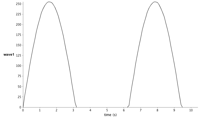
| >>> # generate an image stack similar to before >>> width = 125 >>> height = 250 >>> stack = ImageStack(width, height) >>> for i in range(100): ... ip = ByteProcessor(width, height) ... ip.setColor(int(Math.sin(0.1*i)*256)) ... ip.fill() ... stack.addSlice(ip) ... >>> image = ImagePlus("ImageStack1", stack) >>> image.show() >>> >>> # now create an ROI on the stack and plot the data in a chart >>> xPoints = [10, 15, 10] >>> yPoints = [10, 15, 20] >>> roi = PolygonRoi(xPoints, yPoints, len(xPoints), Roi.POLYGON) >>> roiManager.addRoi(roi) >>> waveManager.importWaves() >>> >>> # select and rename the imported wave for easier access later >>> waveManager.select(0) >>> waveManager.rename("wave1") >>> waveManager.plot() >>> |

|
>>> charts = WindowManager.getCharts() >>> print charts >>> # The 'chart' is actually an instance of ChartFramePlugIn >>> # Therefore, it can be manipulated like a normal Frame object from the Java API >>> charts[0].setSize(400,200) >>> charts[0].setLocation(100,100) >>> >>> # To access the JFreeChart you can use the following >>> jfreechart = charts[0].getChart() >>> # or for XYPlot >>> plot = charts[0].getXYPlot() >>> plot.getDomainAxis().setRange(0, 5) >>> plot.getRangeAxis().setRange(0.5, 1) >>> |
|
>>> # FrontChart() provides a means of affecting the "front chart" >>> FrontChart().setSize(600,300) >>> FrontChart().setLocation(200,200) >>> >>> # modify the x- and y-axes by their axis labels or 'bottom' for the x-axis >>> FrontChart().setAxisRange("bottom", 0, 10) >>> FrontChart().setAxisRange("wave1", 25, 125) >>> |
| >>> from org.jfree.chart.annotations import XYTextAnnotation >>> annotation = XYTextAnnotation("test", 1.5, 0.75) >>> plot.addAnnotation(annotation) |
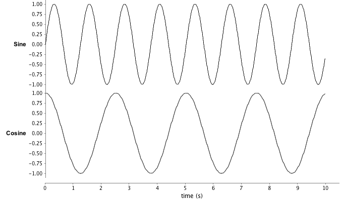
| >>> wave = Wave() >>> wave.setName("Sine") >>> wave.setSamplingRateHz(100) >>> for i in range(999): ... wave[i] = Math.sin(0.05*i) ... >>> wave2 = Wave() >>> wave2.setName("Cosine") >>> wave2.setSamplingRateHz(50) >>> for i in range(500): ... wave2[i] = Math.cos(0.05*i) ... >>> waveManager.addWave(wave) >>> waveManager.addWave(wave2) >>> plot = waveManager.plot() |

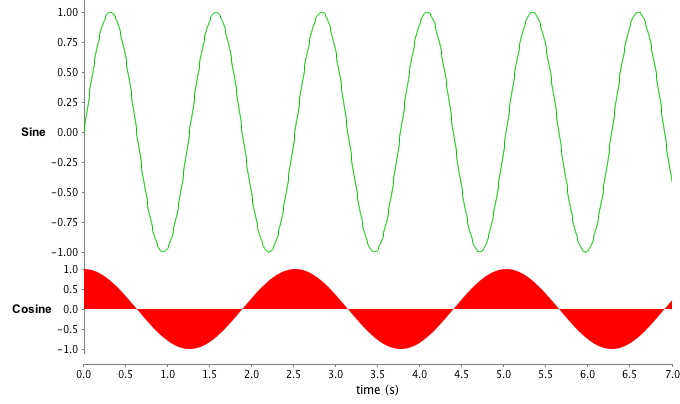
| >>> FrontChart().setWaveStyle("Cosine", "area") >>> FrontChart().setWaveColor("Cosine", Color(255, 0, 0)) >>> FrontChart().setAxisExtents("Sine", 0, 0.75) >>> FrontChart().setAxisExtents("Cosine", 0.75, 1) >>> FrontChart().setWaveColor("Sine", Color(0, 200, 0)) >>> FrontChart().setAxisRange("time (s)", 0, 7) >>> |
